
NS1 · 2020–2022
Every region at a glance
Redesigning the Pulsar dashboard so network engineers can spot traffic problems across every region in one view, instead of drilling into each one.
Result
Problems found sooner
Engineers scan every region and the usual trouble spots in one view, without drilling into individual data sets.
The demo tool
Sales engineers used the new dashboard to pitch Pulsar and onboard new customers.
Fewer how-to questions
Fewer customers needed a sales engineer to learn the product, freeing them to onboard and find new customers.
Background
Data without insight
Pulsar is NS1's traffic steering product. It uses performance data to decide where network traffic should go. Its users are network engineers and DNS admins at large companies, usually one or two per customer.
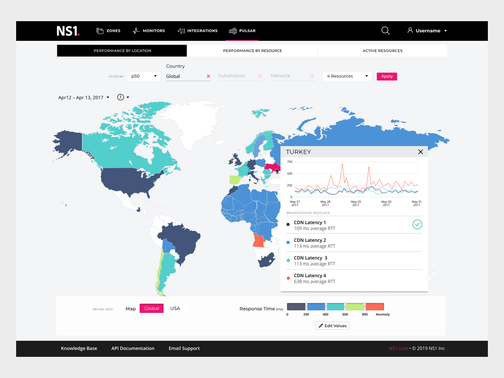
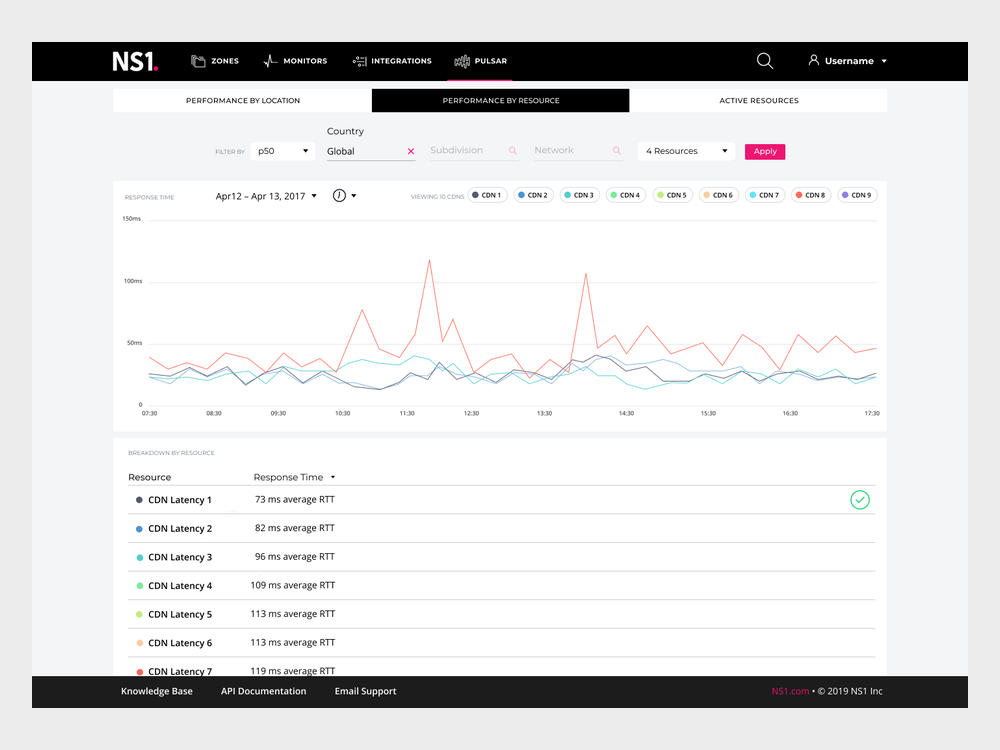
The old dashboard had the data but didn't say what it meant. To check DNS load balancing, an engineer opened one country or one resource at a time and compared the numbers in their head. Spotting a problem meant knowing where to look first.
Research
Fifteen users and a crash course
Pulsar had about 15 to 20 users in total, so formal studies weren't realistic. I learned the domain from the team instead: the engineers gave me a crash course in network routing, and I sat in on service engineer calls while they troubleshot customer problems.
Before each new piece of work, we walked through three things together: how users solved the problem today, how they did it in Pulsar, and what they were asking for. Then we tested and iterated in small chunks.
How they do it today
The workarounds engineers used outside Pulsar.
How they do it in Pulsar
Where the product helped, and where it got in the way.
What they're asking for
Requests that came through sales and service engineers.
Structure
One place to start
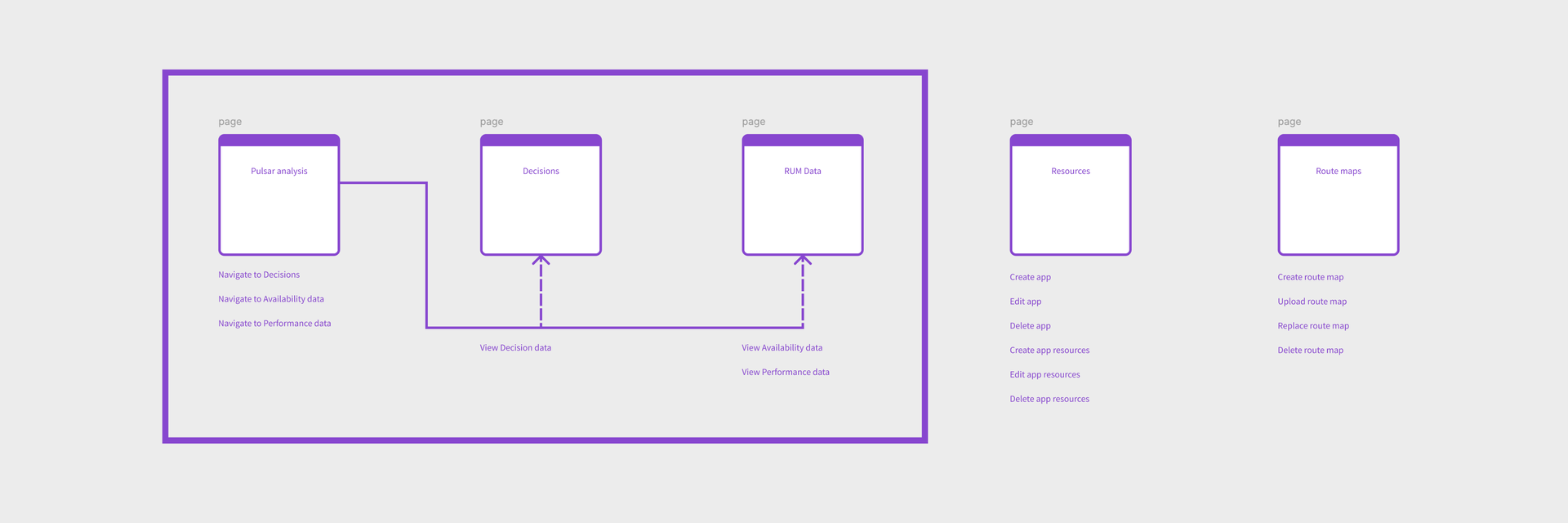
I reorganized Pulsar around how engineers actually check on it. A new Analysis page became the starting point, with paths into the two kinds of data behind it: Decisions, where Pulsar sent traffic, and RUM Data, how each resource performed for real users. Setup tasks, like managing resources and route maps, moved to their own pages so they stayed out of the way.
Solution
Scan first, drill down second
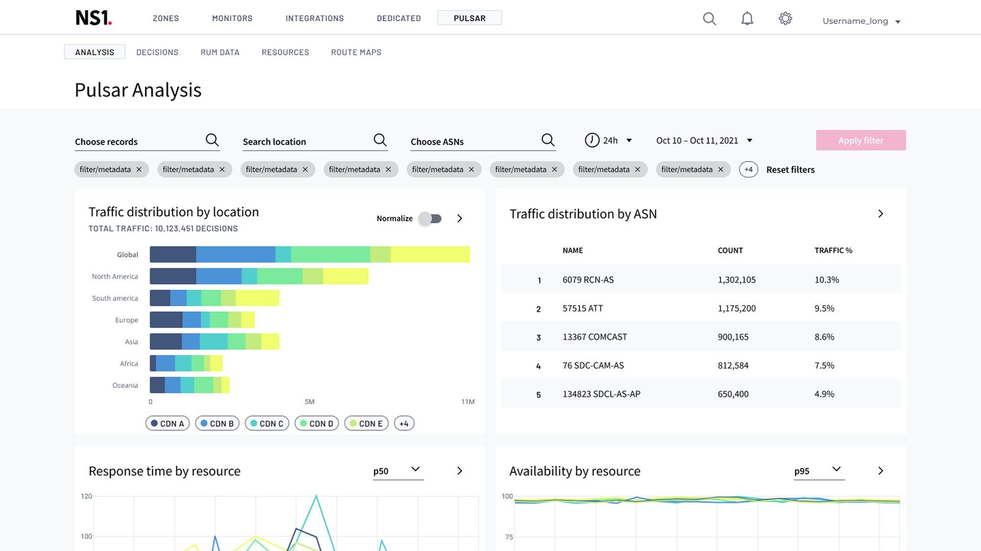
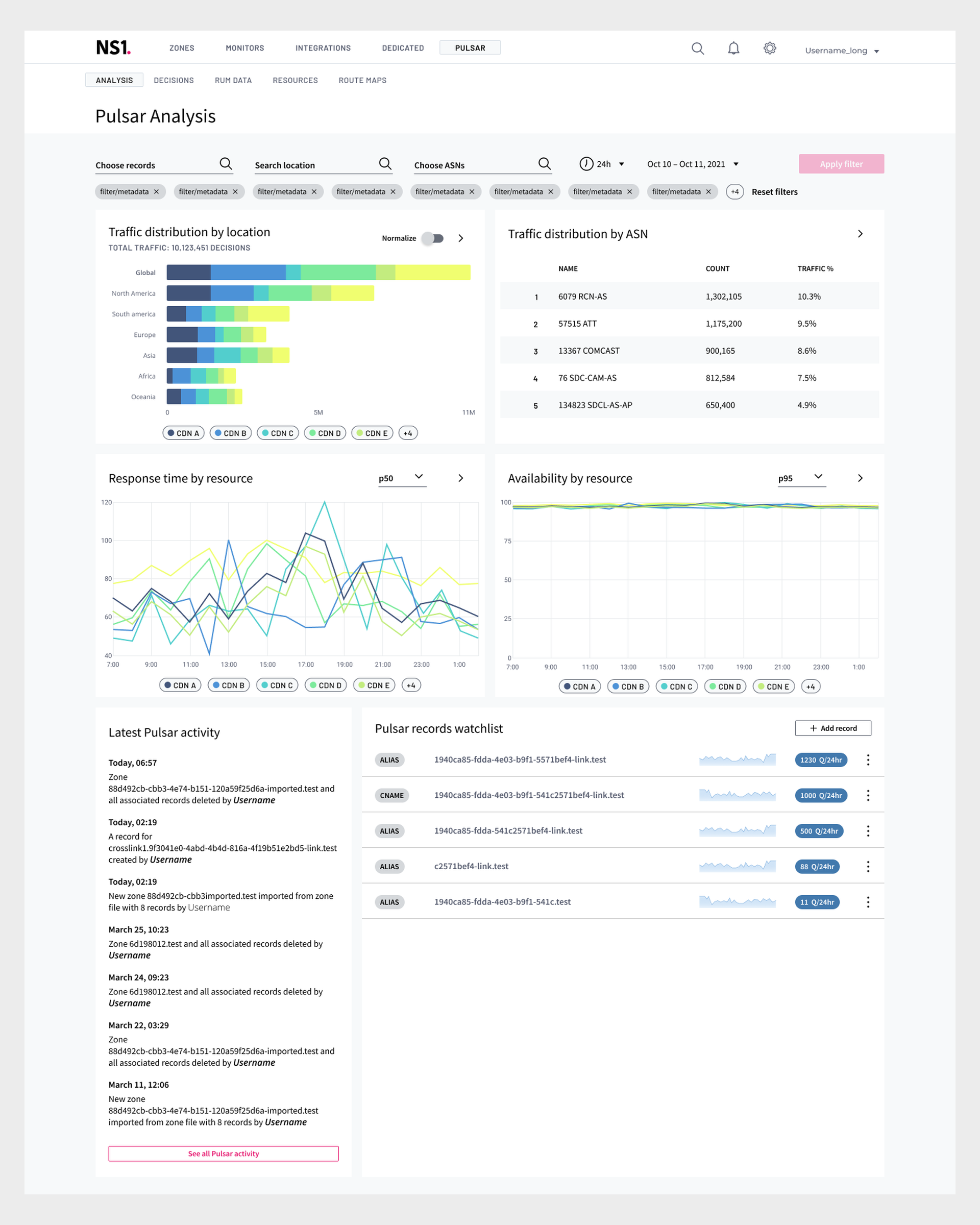
The Analysis page sits on top of the metric pages. It pulls the signals engineers checked most often into one overview: traffic distribution across every region, the top networks, response time and availability by resource, recent activity and a watchlist of records.
Load balancing across every region reads in a single chart. A problem shows up in the scan, and the arrow on each card leads to the detail.
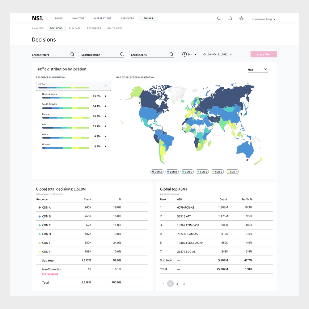
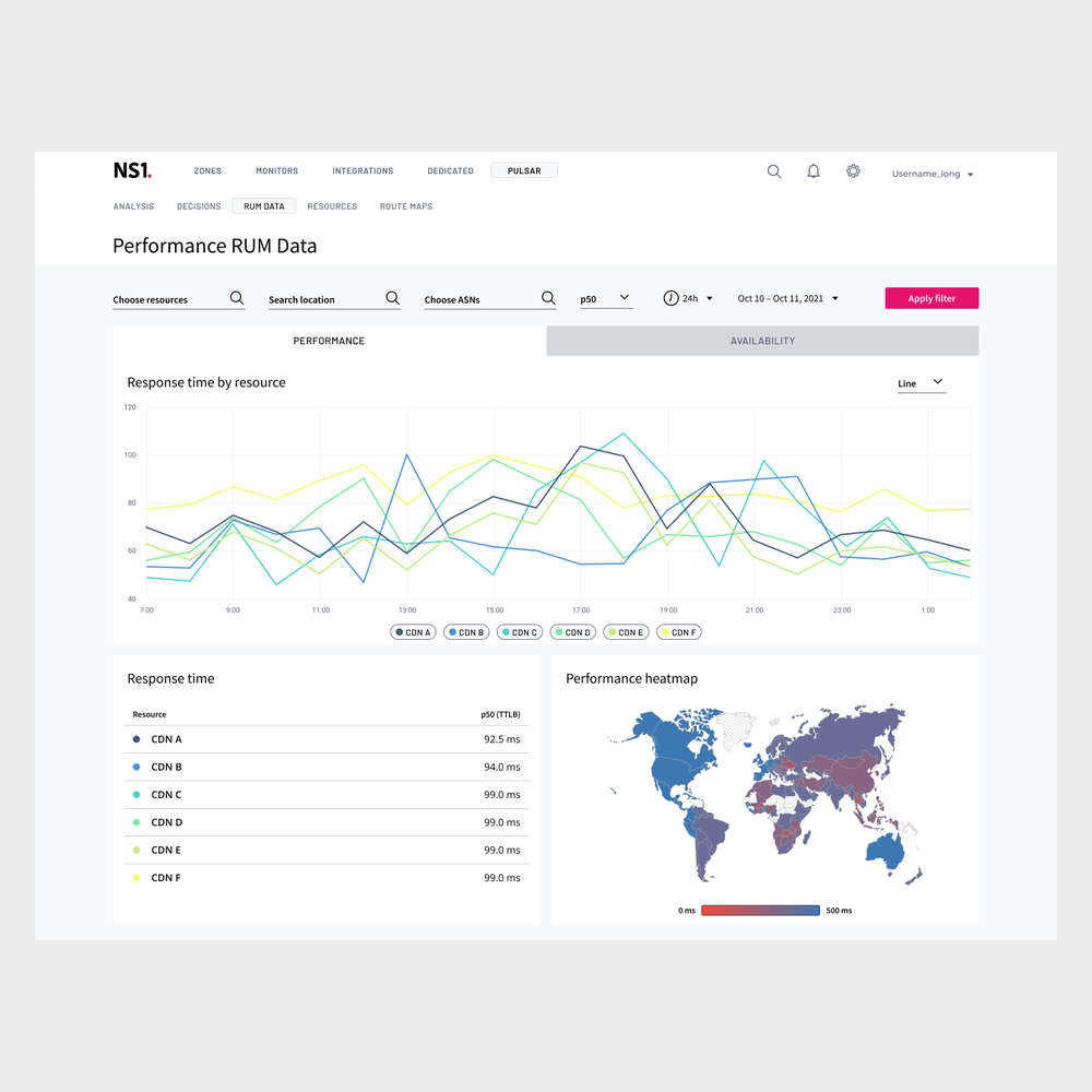
Underneath, each metric page was reframed around its data source, so the numbers carry the context needed to read them. Decisions shows where traffic went, by region and by network. RUM Data shows how each resource performed, over time and on a map.
Design system
60+ components, rebuilt
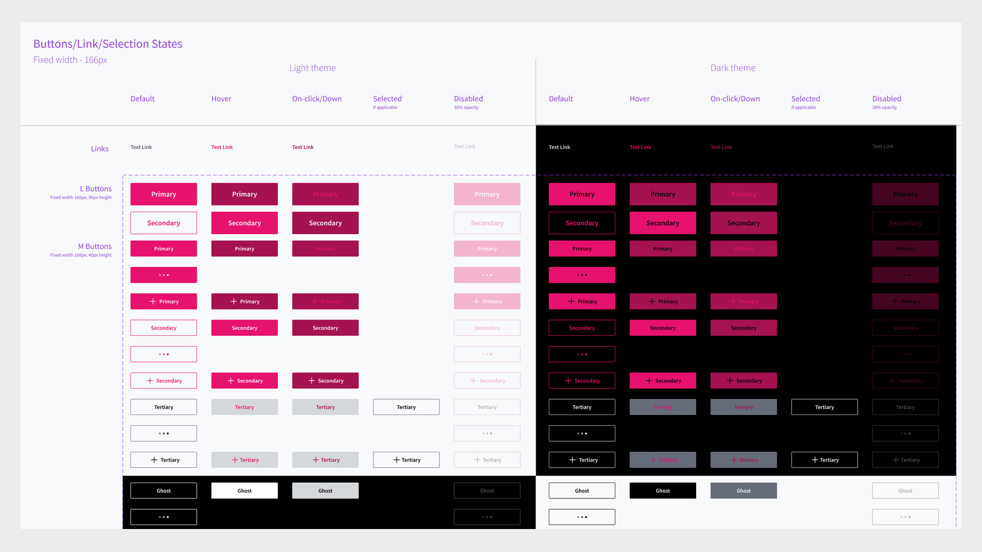
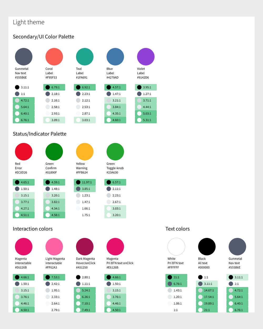
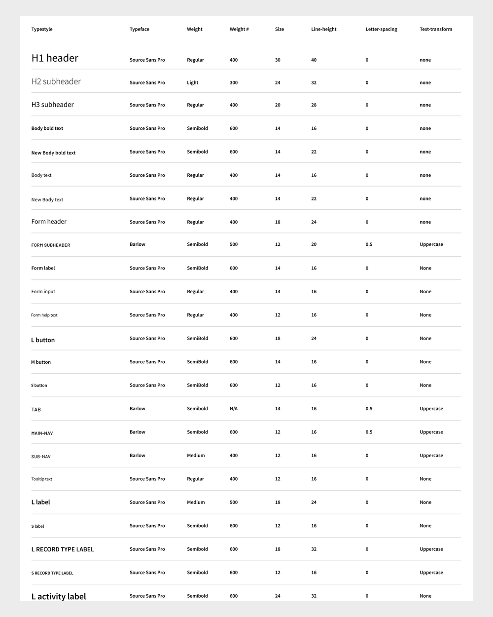
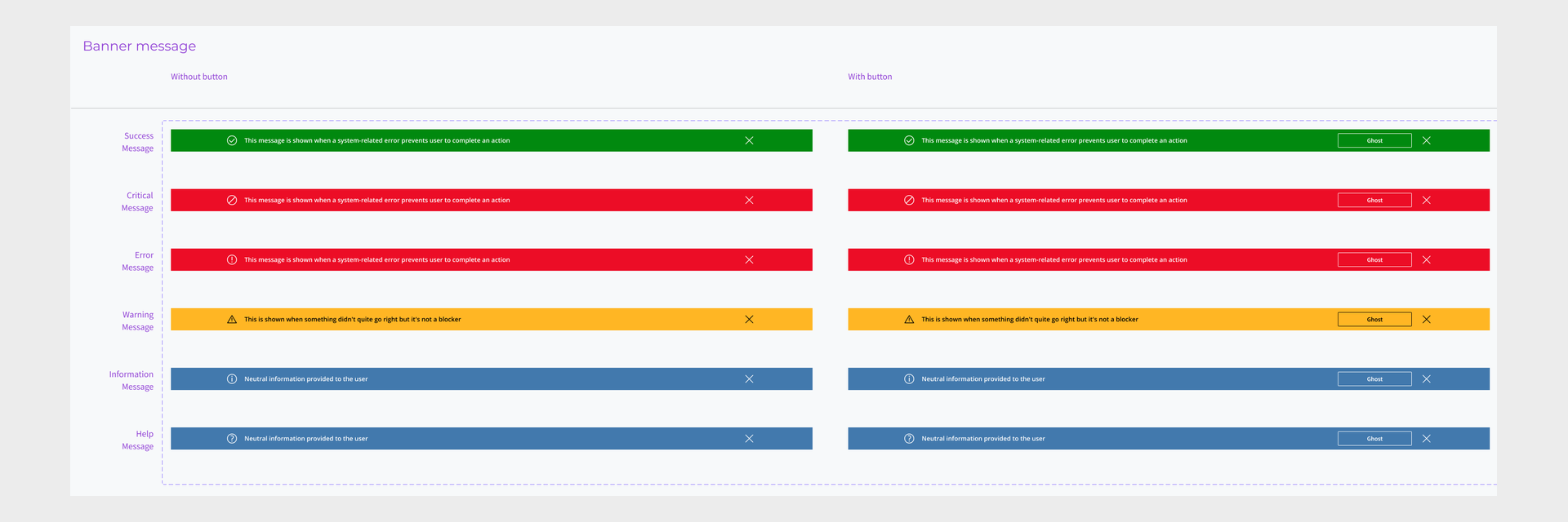
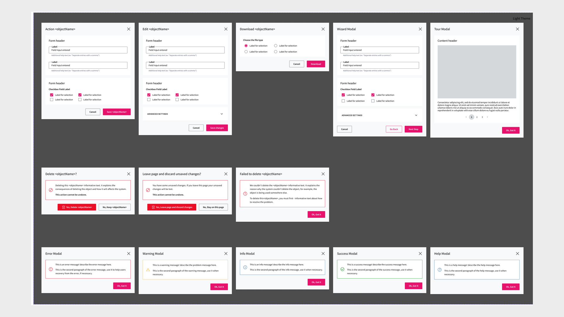
Alongside the dashboard, I rebuilt more than 60 components in a refresh of Pulsar's look and feel. Every component was specified for light and dark themes, with each state laid out: default, hover, pressed, selected and disabled. A consistent visual language and shared interaction patterns made a dense, technical product easier to learn.
Exploration
Filter chains
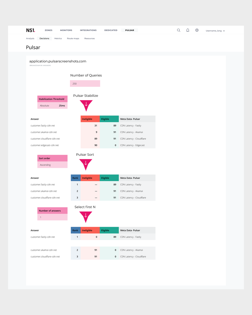
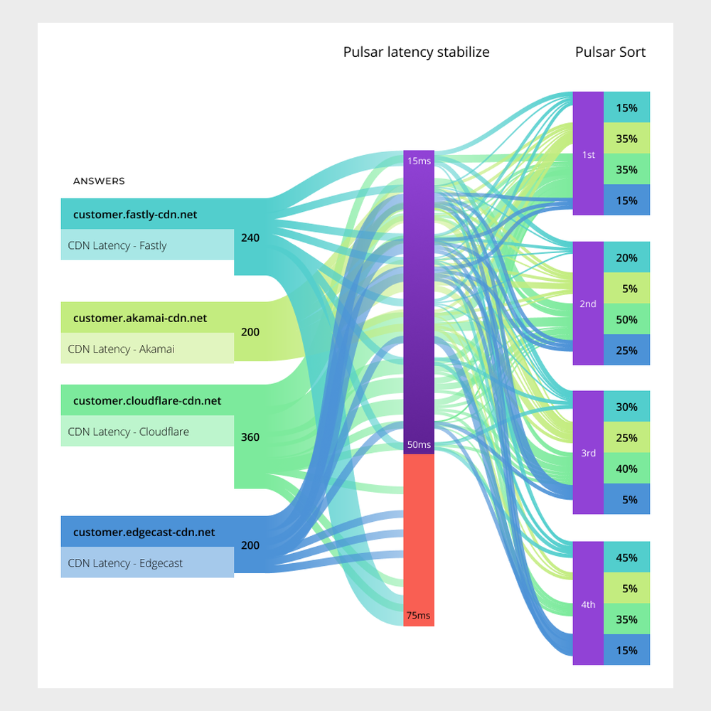
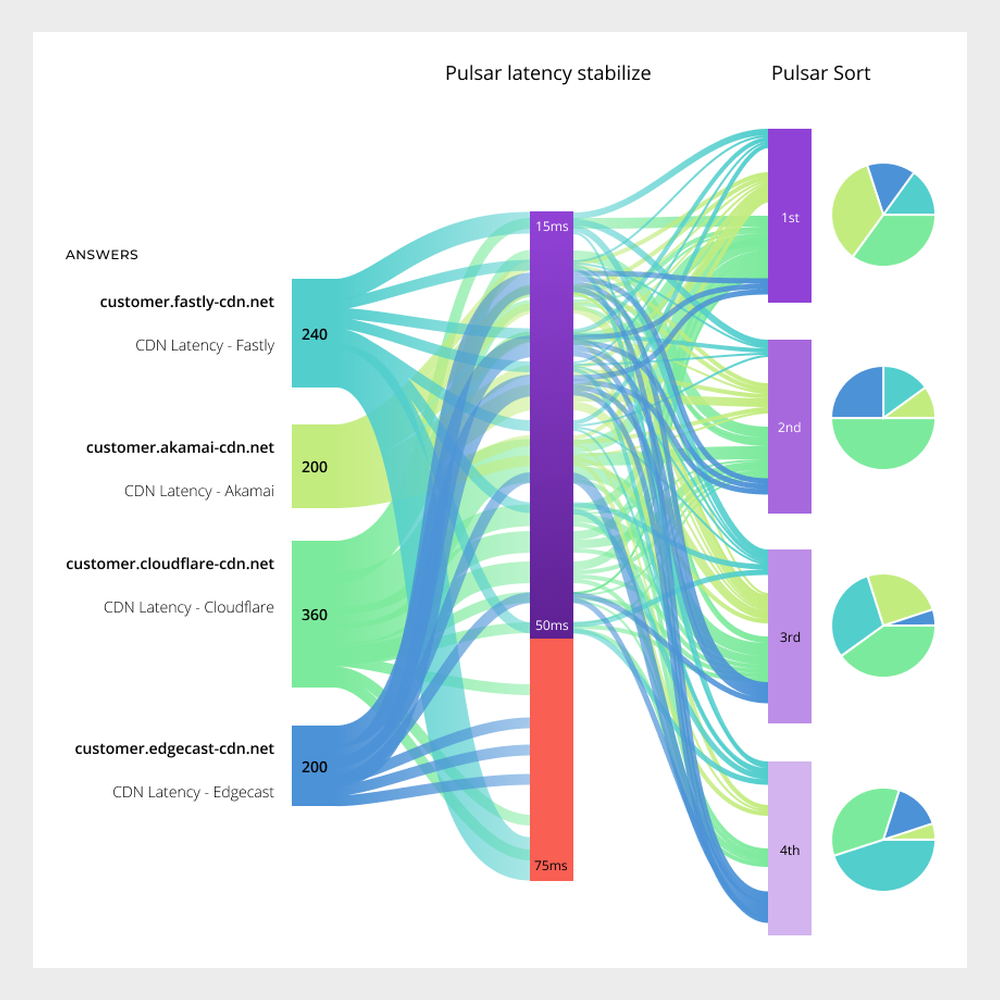
Pulsar picks an answer by passing every query through a chain of filters. Stabilize drops answers that are too slow, Sort ranks the rest, and Select first N returns the winner.
Engineers set these chains up, but couldn't see them at work. I explored ways to show how a routing decision gets made, step by step and in aggregate. None of these views shipped.
Reflection
What I learned
Borrow the experts' ears
With only a handful of users, sales and service engineers were the closest thing to a research panel. Their calls showed me the real problems faster than any study could.
Show the pattern, not the data point
Expert users don't need less data. They need to see where to look first.
More work