
SPINS · 2020
No more drinking from the firehose
Redesigning the SPINS data ingest dashboard so data ops can see what's wrong and where, instead of digging through raw logs.
Result
Time for data ops to find an ingest issue, from first alert to knowing what's wrong and where.
Background
SPINS and data ingest
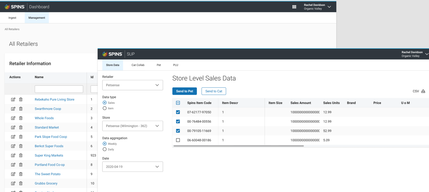
SPINS is a data company for the natural, organic and specialty products industry. Retailers send in point-of-sale data every week; SPINS maps it to stores and products and turns it into market insight.
The ingest dashboard is the internal tool data ops uses to manage retailers and stores and keep that data flowing. When I joined, it showed everything and explained nothing.
I was the only product designer on an extreme programming team, and I ran the user interviews and the pattern testing behind the redesign.
“I just need to know what the issue is.”
The status quo
Finding one error
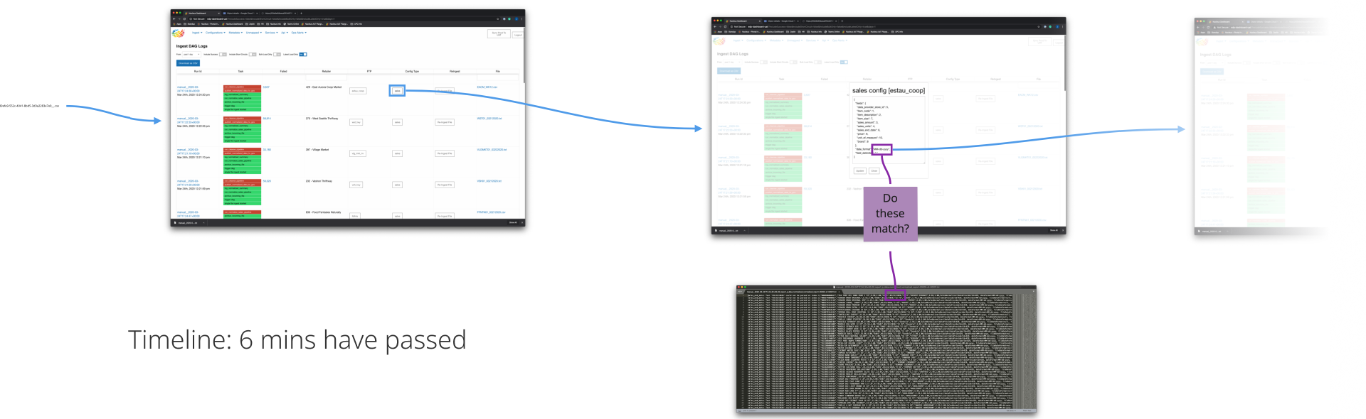
Here's what it took to find a single ingest error before the redesign.
- 0 min
Start in the DAG logs
Rows of red and green task states. A failed run links out to Google Cloud Storage.
- 2 min
Open the raw file
Download it or open it in the browser: thousands of unhighlighted lines.
- 5 min
Find the error line
Each line packs the error, the file row and a giant string of metadata. Here, a date was in the wrong format.
- 6 min +
Match it to the config
Compare the retailer's sales config to the file by eye. Another 5–30 minutes to reach the fix, then a re-ingest to confirm it.
Objectives
Project goals
Change how data ops sees the problem
Move from a stream of individual failures to a map of what's complete and what isn't.
Identify the error
Show what failed, where and why, without opening a raw file.
Surface the state of ingest
At a glance: which retailers, stores and weeks have complete data, partial data, or none.
Personas
Who uses ingest data
Data Ops
“Clean, organized, and correct.”
Keep weekly retailer data flowing, and fix it when it breaks.
Data Science
“Looking at the buckets of data.”
Work with ingested data in aggregate, and need to trust each bucket.
Product + Sales
“What can we do with this?”
Need to know what data SPINS has before they can sell it.
Workflow
Retailer, then store, then week
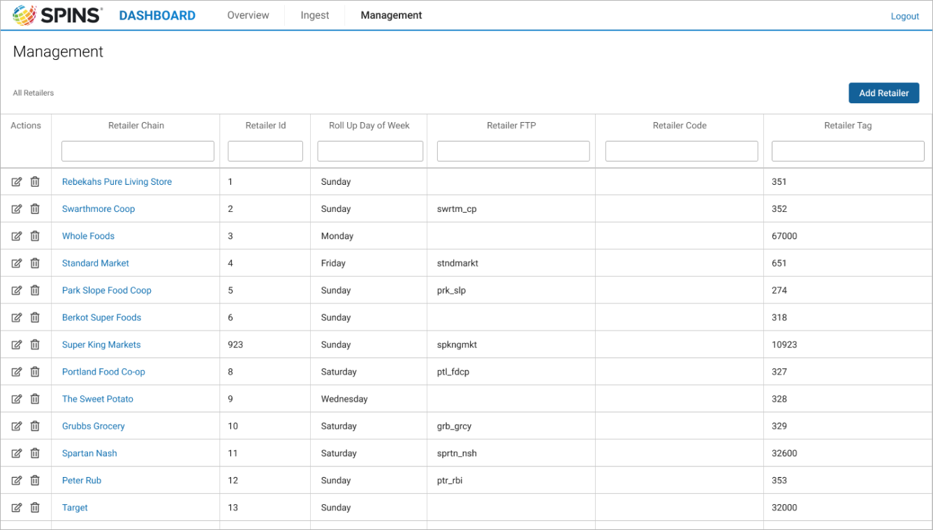
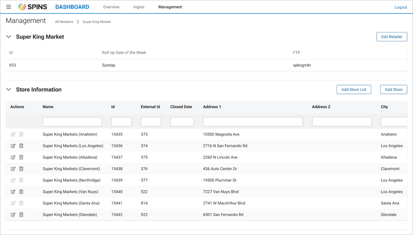
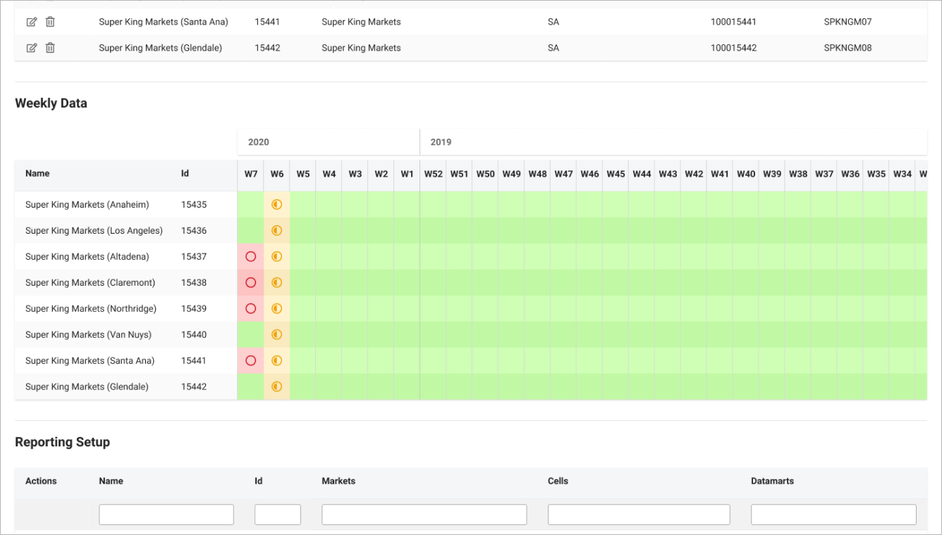
Retailers were the first logical bucket. Every user knew them, from data ops to sales, and they follow the API's own call and response structure. Selecting a retailer opens its stores, and each store shows its weekly ingest status.
Defining patterns
Complete, partial, missing
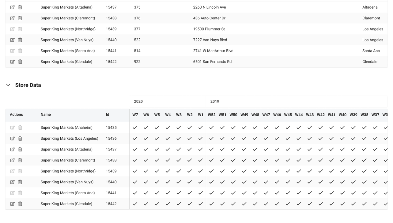
The first weekly view was a wall of check marks. Interviews showed it hid the gaps and couldn't show partial data or errors.
I tested icon shapes and colors with users. Every user preferred circles: full, half and empty read as complete, partial and missing. Stars read as a rating. Then we removed the complete state entirely, because a full circle on every healthy week added noise and no information.
Workflow
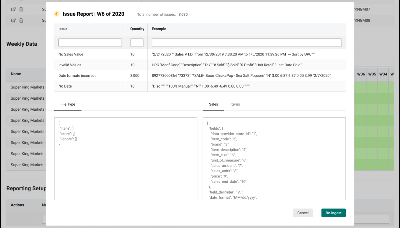
Bring the fix to the error
The issue report lists each problem, how many rows it hits and an example, next to the file config and a re-ingest button. No more jumping between programs or remembering line numbers.
Reflection
What I learned
Show the exception, not the rule
Removing the complete state made gaps and errors the only thing on screen. Data ops didn't need more data; they needed less of it, in the right shape.
Bring the fix to the error
Most of the lost time went to moving between tools. Putting the issue, the config and re-ingest in one place mattered more than any single screen.
More work